
NEW YORK — In these uneasy times, as we move along to a new decade, the Pantone Color Institute has reached back in time to calming, confident Classic Blue as its color of the year for 2020.
The color is an anchor offering stability, constancy and connection, said Laurie Pressman, vice president of the global purveyors of color consulting, trendspotting and analysis.
“It’s a reassuring presence,” she told The Associated Press ahead of Wednesday’s reveal.
Akin to maritime blue — not indigo and brighter than navy — Classic Blue evokes a feeling of vast expanse, Pressman said of the shade also known as Pantone 19-4052.
Pressman and her team scoured the worlds of art, fashion and home decor, along with commercial, graphic and industrial design, to come up with the pick, as they have since Cerulean became the inaugural color of the year for the milestone 2000.
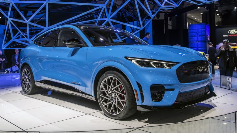
But Classic Blue isn’t just about nostalgia, she said. Creators around the globe are putting out modern takes for runways, mobile phones, kitchen appliances and the paint of pricey, forward-looking cars and motorcycles. Pantone 19-4052 is just a shade darker than the color of the Ford Mustang Mach-E GT that was on display at the car’s reveal:
Whether as throwback or harbinger of things to come, the color harkens back to when things “seemed simpler, seemed more comfortable, but at the same time not suggesting that it be done in a way that it was then,” Pressman said.
Cerulean, which heralded the new millennium, is the color of the daytime sky, while Classic Blue is the sky at dusk as the new decade commences.
“It has depth to it, but it’s a color of anticipation because we’re looking ahead,” Pressman said. “The day is over. We’re looking forward to the evening. What’s going to come?”
Classic Blue is a vibrant yet non-aggressive and easily relatable color, she said. It’s also among nature’s anthocyanin pigments possessing antioxidant and other health-fostering benefits.
Think blueberries.
“Many of us feel stressed, completely overloaded,” Pressman said. “We live these 24/7 lifestyles. We’re anxious. There’s so much uncertainty and unrest, no matter where you are. With that we’ve seen this whole increased focus on wellness and self-care.”
The timeless color is also gender neutral and seasonless, mixing well with other shades throughout the spectrum yet making a strong statement on its own. It also works well in a range of textures.
“It’s a color that can take on different appearances through different applications, finishes and textures,” Pressman said, lending itself to everything from lustrous sheens to sparkly sequins.
The anointed blue also plays into the sustainability movement.
“We have all this focus on buy less, buy good, so people aren’t throwing things into a landfill,” Pressman said. “You read about buying things to last and this is a timeless blue shade. It’s always there and you’re comfortable with it, like blue jeans.”
For offices, it offers an air of security, she said. For kitchens, it’s a top accent color in appliances and walls. Classic Blue is a mainstay color in stemware, dishes and other tabletop staples as a trusted expression of elegance, she said.
“Everybody’s comfortable with blue,” Pressman said. “We know it. We like it.”